Módulo 3: Estilos y Clases
CSS Units
Styles panel
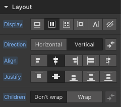
Layout
Cuando agregas un elemento al lienzo, su opción de visualización predeterminada determina su apariencia:
Block, Flex, Grid, Inline-block, Inline, None
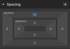
Spacing
Permite definir el espaciado de un elemento: hacia dentro (padding) y hacia fuera (margin).

Size
Por defecto, un elemento se expande para llenar el ancho de su elemento padre o toma el tamaño del contenido dentro de él. En este panel se puede configurar.
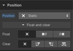
Position
Establece la posición de los distintos elementos:
Static, Relative, Absolute, Fixed, o Sticky.

Typography
Determina exactamente cómo se verán los textos de tu web.
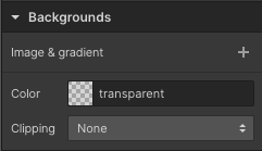
Backgrounds
Puedes agregar una imagen de fondo, un degradado o un color a cualquier elemento, excepto a los elementos multimedia.
También Puedes cambiar el tamaño, la posición, ajustar el clipping, etc.
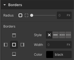
Borders
Los bordes definen el radio de los bordes de un elemento o crean contornos en uno o más lados del límite de un elemento.
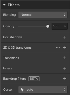
Effects
Puedes ajustar efectos como Blending, Opacity, Box shadows, 2D & 3D transforms, Transitions, Filters, Backdrop filters, y Cursor.
Clases
Selector
El lugar donde crear, inspeccionar, renombrar, duplicar o eliminar clases.
Crear, renombrar, duplicar, eliminar, limpiar
Edita tus clases rápidamente.
Herencia
Cuando no se ha especificado ningún valor para una propiedad heredada en un elemento, el elemento obtiene el valor calculado de esa propiedad en su elemento padre.
Global Classes
Puedes usar clases globales para traer un estilo específico a cualquier clase en su sitio web.
Orange
Los estilos heredados se indican en naranja.
Blue
Nuevos estilos o estilos sobreescritos se indican en azul.
Pink
Utiliza etiquetas de elementos HTML para controlar el estilo predeterminado para un tipo de elemento en particular.
States
Añade interactividad a los elementos cambiando su apariencia y comportamiento en diferentes estados.
Styleguide: El ejemplo de finsweet
Headings
Heading 1
Heading 2
Heading 3
Heading 4
Heading 5
Heading 6
Heading classes
Text size
Text style
text-style-quote
Text weight
Text alignment
Rich text
Heading 1
Heading 2
Heading 3
Heading 4
Heading 5
Heading 6
This is a block quote
A rich text element can be used with static or dynamic content. For static content, just drop it into any page and begin editing. For dynamic content, add a rich text field to any collection and then connect a rich text element to that field in the settings panel. Voila!
This is a link inside of a rich text
- List item
- List item
- List item

Colors
Background classes
Forms
Icon classes
Icons 1x1
Social icons
Container
Max width
Margins
Paddings
Class Naming Systems
Aquí varios Class Naming systems para trabajar de forma organizada en Webflow.